Blue Cross Employee Choice
Problem statement
Blue Cross has developed a benefit product that can be purchased and deployed online without needing to contact a customer service representative. How might we design this online flow to reduce the number of calls to customer service, and ensure business owners have all of the information they need to purchase health benefits for their employees?
About the project
I was the lead designer on this project, working closely with a principal engineer and project manager.
Due to the complex nature of benefits, the project took a few turns with regards to the final direction we wanted to pursue.
NB: This is a product available on both desktop and mobile screen resolutions. For the purpose of this case study I’ve elected to only show desktop versions. If you like to see the fully mobile responsive website, please visit https://marketplace.ab.bluecross.ca/OMP/calculator.
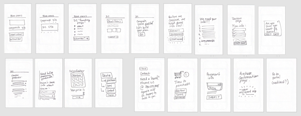
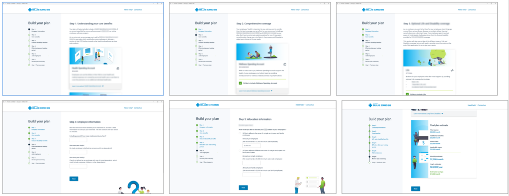
In order to provide users with an accurate estimate, we needed to obtain some preliminary information to give them a ballpark number. At the beginning, this was proposed as a 5 step online form. These are some wire-frames from that early stage (not all steps are shown). Some information is blurred to avoid leaking Alberta Blue Cross proprietary information to competitors.
Process
- Perform an industry survey to gain understanding of how similar companies approach the problem.
- Create user journeys by mind-mapping and consulting with the Customer Experience team.=
- Collaborate with business analysts to fully understand the problem statement, and all of the different scenarios we had to account for.
- Create very rough mock-ups to start envisioning the flow.
- Present rough wire-frames to stakeholders to gain approval for the project.
- Iterate on wire-frames and flows until UX and leadership come to agreement on how best to tackle the problem statement.
- Collaborate with engineering throughout to address limitations and accessibility requirements.
- Work with content design to accurately display information about all of the different health benefit options.
- Deliver final pixel-perfect prototypes for development.
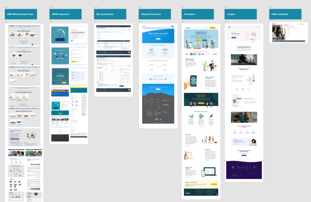
Industry survey
We looked at multiple types of insurance providers (auto, home, health, travel) to see how other businesses tackle the problem.
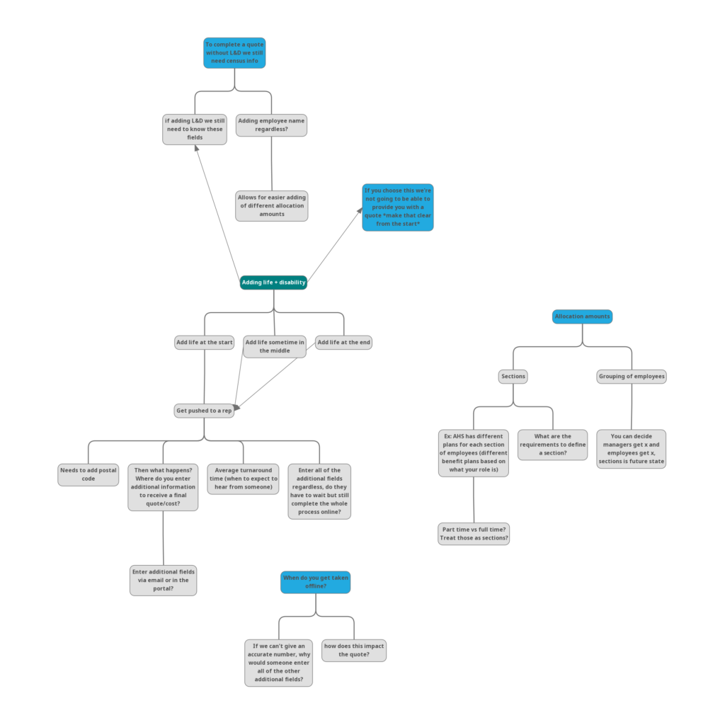
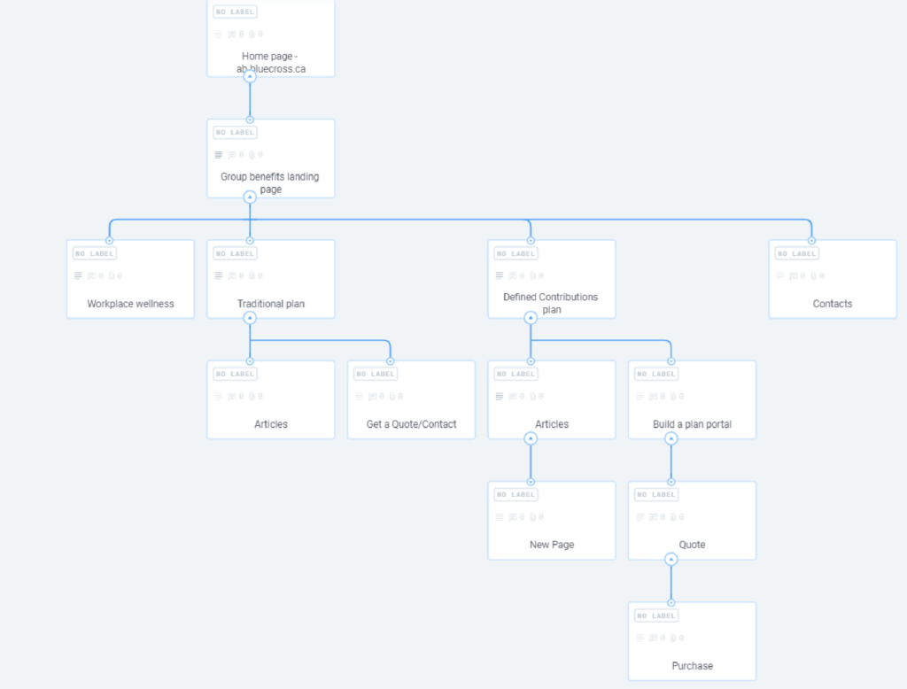
User journey
Here are some mind-maps, card sorting exercises, and other visual elements we used to start imagining the user flow.
Card sort:
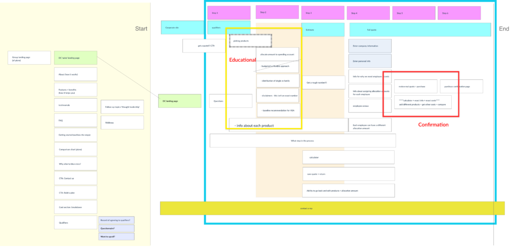
Mind-maps and draft sitemaps
Wireframes/exploration
These are wire-frames from the early stages of ideation, immediately following the mind-mapping, journey mapping, and rough sketches.
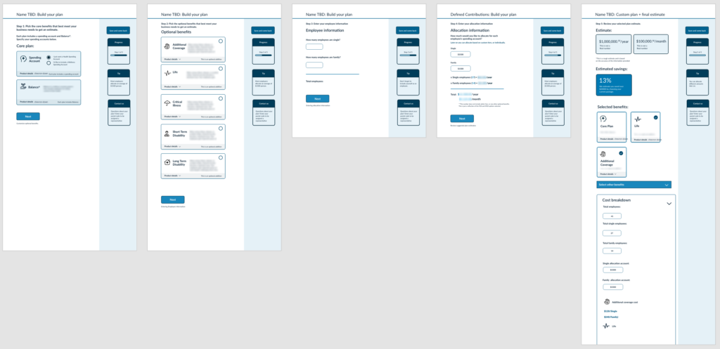
Initial feedback and more exploration
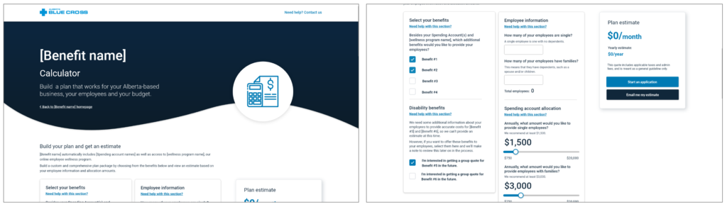
Based on the approval of the prior wire-frames, I began to design screens based on business requirements and feedback from stakeholders. These were designed in a similar style to Alberta Blue Cross’ Travel benefits quote page.
After presenting these screens, the concern was that the process was taking too long, and that we should try to reduce the number of steps. Stakeholders were also concerned that it looked “too similar” to our other products, and that they really wanted it to stand out, and be perceived as more “modern” and “fresh.”
New direction proposed
Rather than reduce the number of steps involved in getting a quote for the benefit plan, and increasing the number of steps required later, we positioned front-loading all content, so that the act of purchasing was very easy (once a quote was obtained, there would be no further work required on behalf of the user).
Business liked the concept of a quick purchase, but felt it was still too long of a process.
They also did not like the change in design direction, and instead wanted something that looked “more serious.”
Going rogue
At this point, both my PM and myself were grasping at straws, since it seemed like there was no right solution that would meet the requirements, but also align with the stakeholder’s goals.
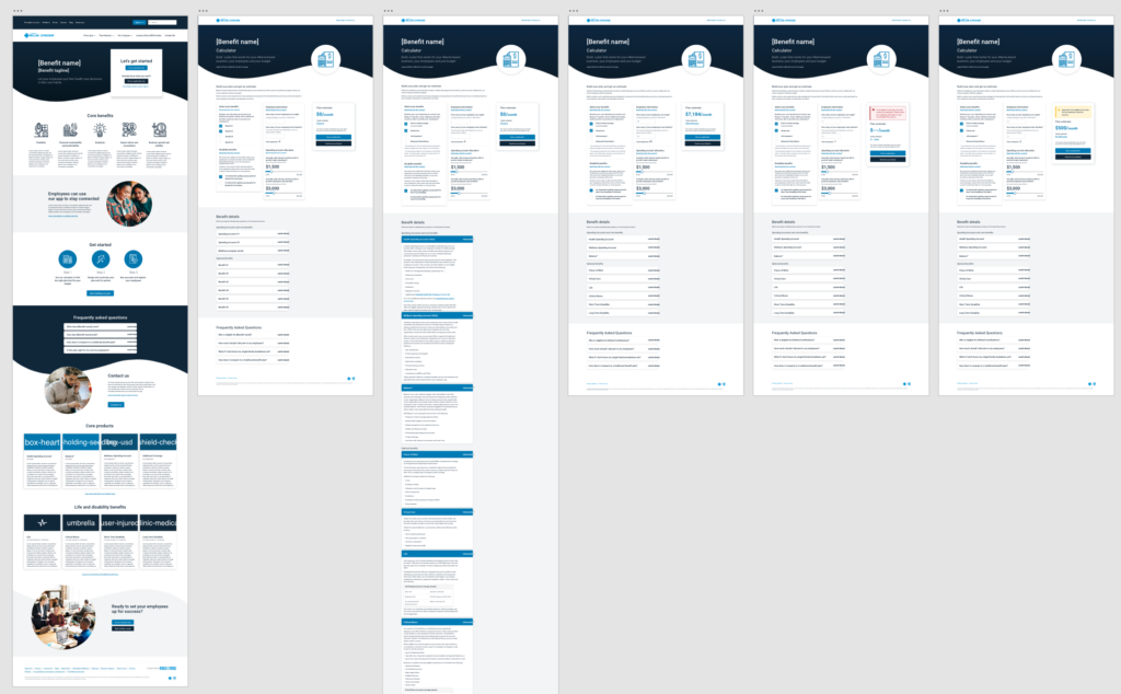
I had an idea for a single-page calculator that cut down greatly on the amount of content and context, but would make up for it with the quickness of receiving a quote. It would also decrease the accuracy of the number shown, but we proposed that this was a drawback we were willing to accommodate for.
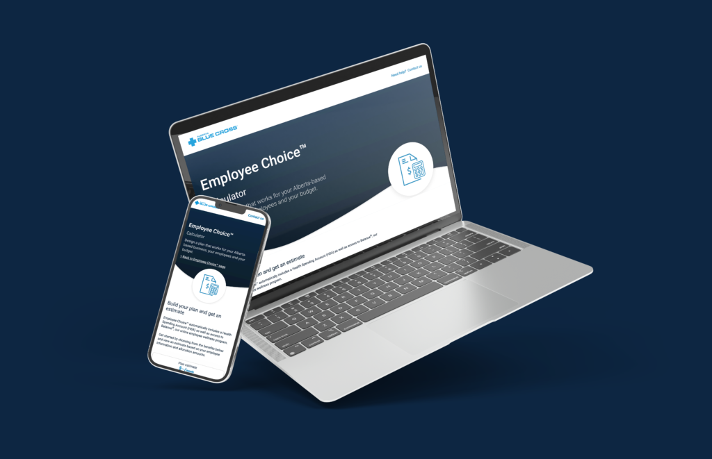
The “calculator” idea was immediately approved, and is live on the Alberta Blue Cross website, as well as the entire flow following receiving quote.
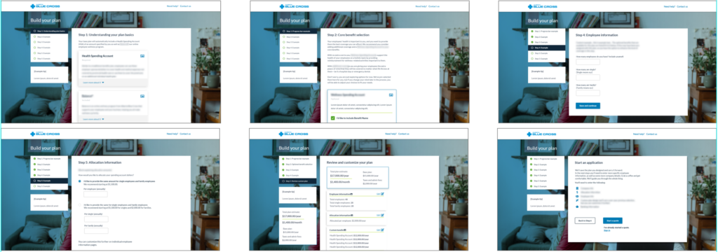
Final screens
All design edge cases were accounted for, including error states, egibility problems, and payment processing issues. The project ended up requiring a total of around 50 separate screens, and the design phase lasted about a year before being handed over to development.
Example landing page and “calculator” screens:
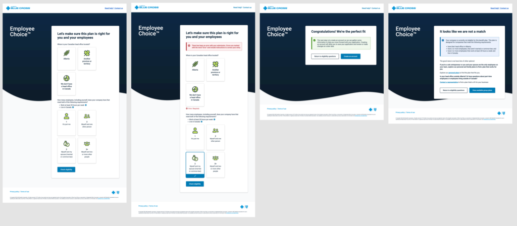
Example “eligibility check” screens:
Rather than upload more screenshots, here is a promotional video Alberta Blue Cross posted to their website, describing how to purchase the Employee Choice Benefit Plan.
Mockup of final design